|
Our last two units are the smallest part if the Georgia Milestones according to content weights. Therefore I am touching on statistics this week. I CAN STATEMENTS....LEARNING TARGETS... 6.SP.1. Recognize a statistical question as one that anticipates variability in the data related to the question and accounts for it in the answers. For example, “How old am I?” is not a statistical question, but “How old are the students in my school?” is a statistical question because one anticipates variability in students’ ages. 1. I can identify statistical questions. 2. I can explain how data answers statistical questions. 6.SP.2. Understand that a set of data collected to answer a statistical question has a distribution which can be described by its center, spread, and overall shape. 3. I can describe a statistical data set using center, spread, and shape. 6.SP.3. Recognize that a measure of center for a numerical data set summarizes all of its values with a single number, while a measure of variation describes how its values vary with a single number. 4. I can compare a measure of center with a measure of variation. 6.SP.4. Display numerical data in plots on a number line, including dot plots, histograms, and box plots. 5. I can communicate numerical data on a number line (dot plots, histograms, and box plots). 6.SP.5. Summarize numerical data sets in relation to their context, such as by: a. Reporting the number of observations. b. Describing the nature of the attribute under investigation, including how it was measured and its units of measurement. c. Giving quantitative measures of center (median and/or mean) and variability (interquartile range and/or mean absolute deviation), as well as describing any overall pattern and any striking deviations from the overall pattern with reference to the context in which the data were gathered. d. Relating the choice of measures of center and variability to the shape of the data distribution and the context in which the data were gathered. 6. I can summarize numerical data sets. 7. I can analyze the relationship between measures of center and the data distribution. MONDAY - Activating: GO over AREA IN THE REAL WORLD from last week. Lesson: Students work through PPT - Statistical Questions - with teacher, practicing identifying what makes a good statistical question and what doesn't. Exit Ticket: page to answer questions Homework: Statistical questions WS
TUESDAY - Activating: Check homework with a MEET ME AT partner. Lesson: Discuss and practice the ways to describe a data set using the following terms: Symmetry: When it is graphed, a symmetric distribution can be divided at the center so that each half is a mirror image of the other Peak: A point on the graph that is higher than the points directly to the left and right. Skewed left/right: A graph is skewed left if it is highest to the right, then becomes lower as it goes left. A graph is skewed right if it is highest at the left and lowers as it goes right. Uniform: A graph that is evenly spread out, with no peaks. Outlier: An element of the data set that is much higher or much lower than all the other elements. Gap: An area of the distribution where there are no entries in the data set. Practice with PPT - Shapes of Distribution using note catcher. Exit Ticket: Explain to a partner what each of the following graphs would look like: skewed, uniform, and peak Homework: Shapes of Distribution - describing graphs - 2 sided
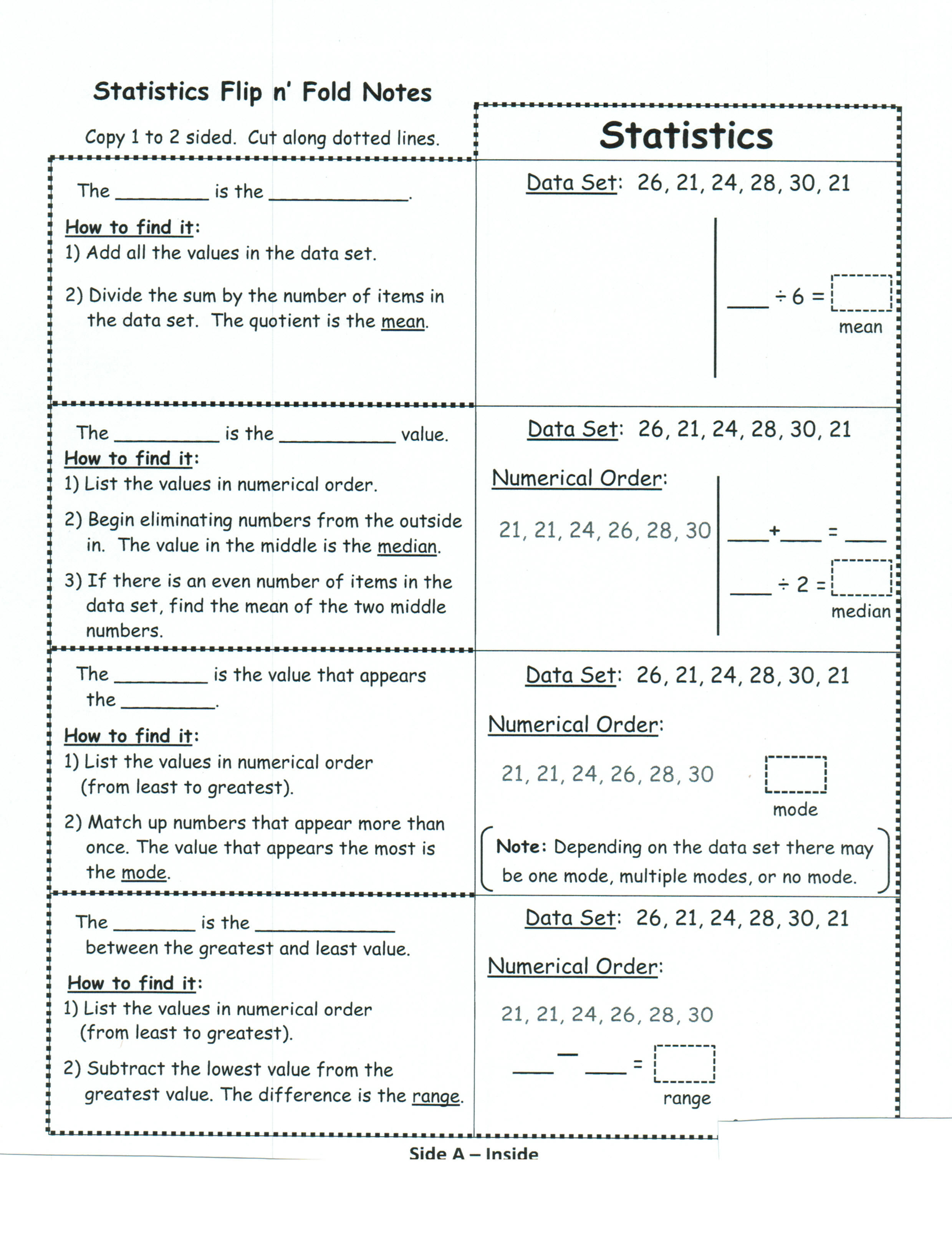
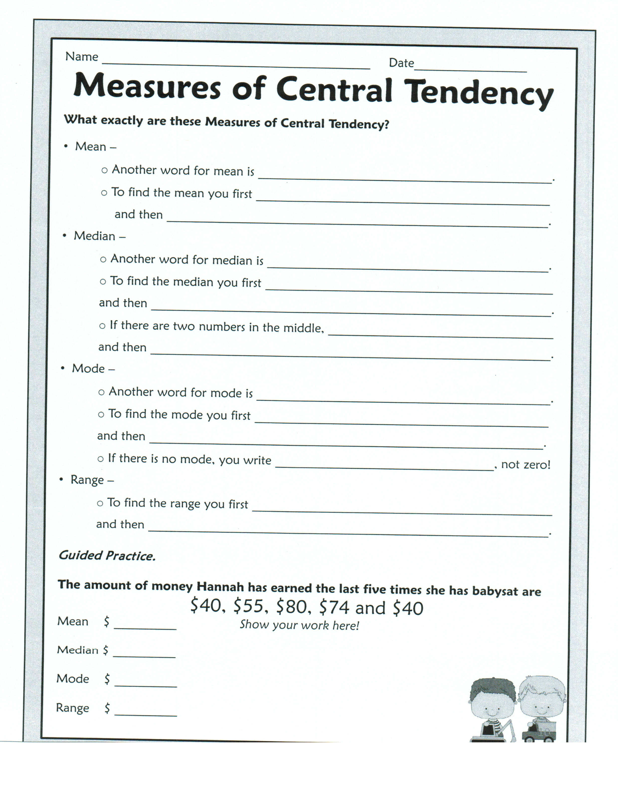
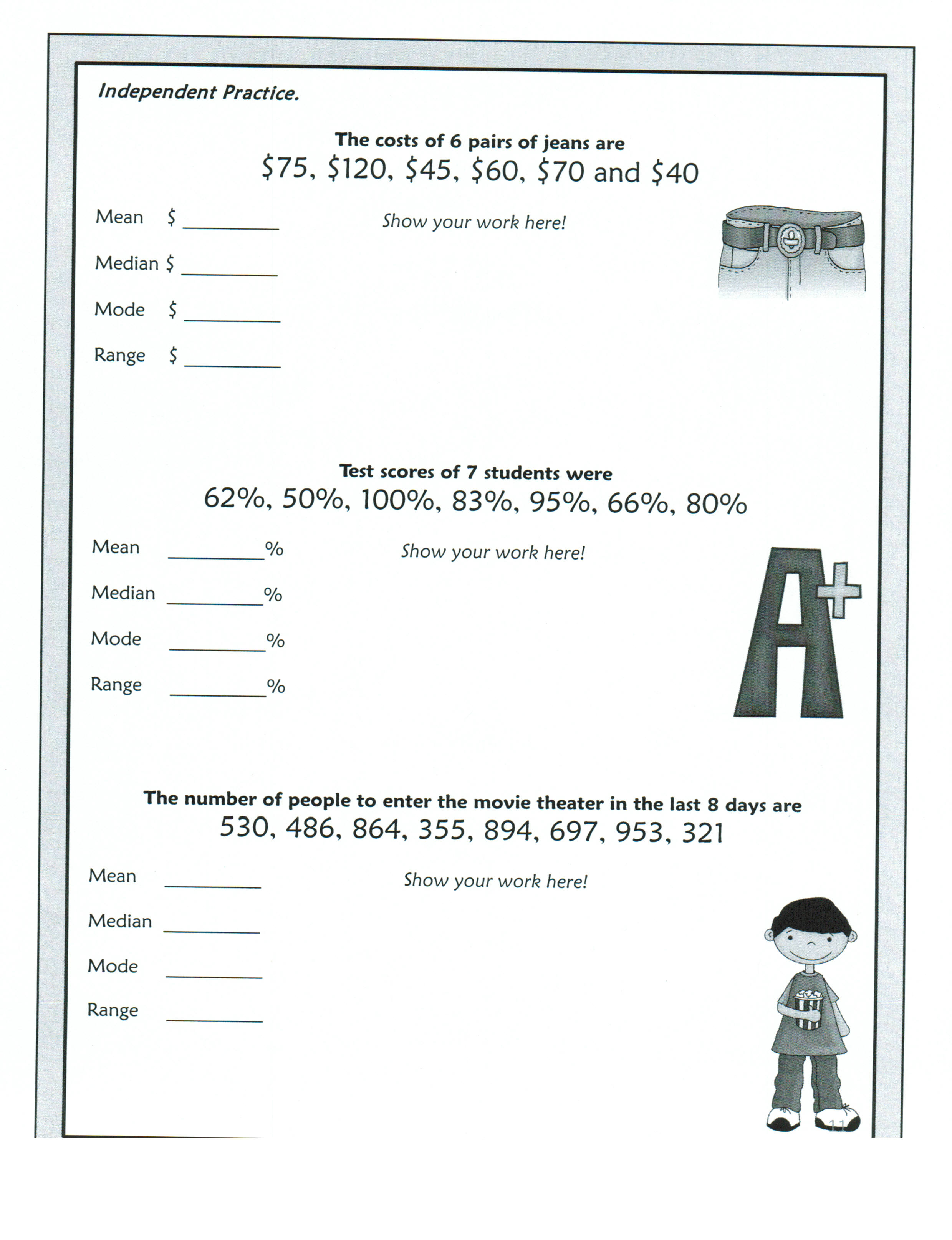
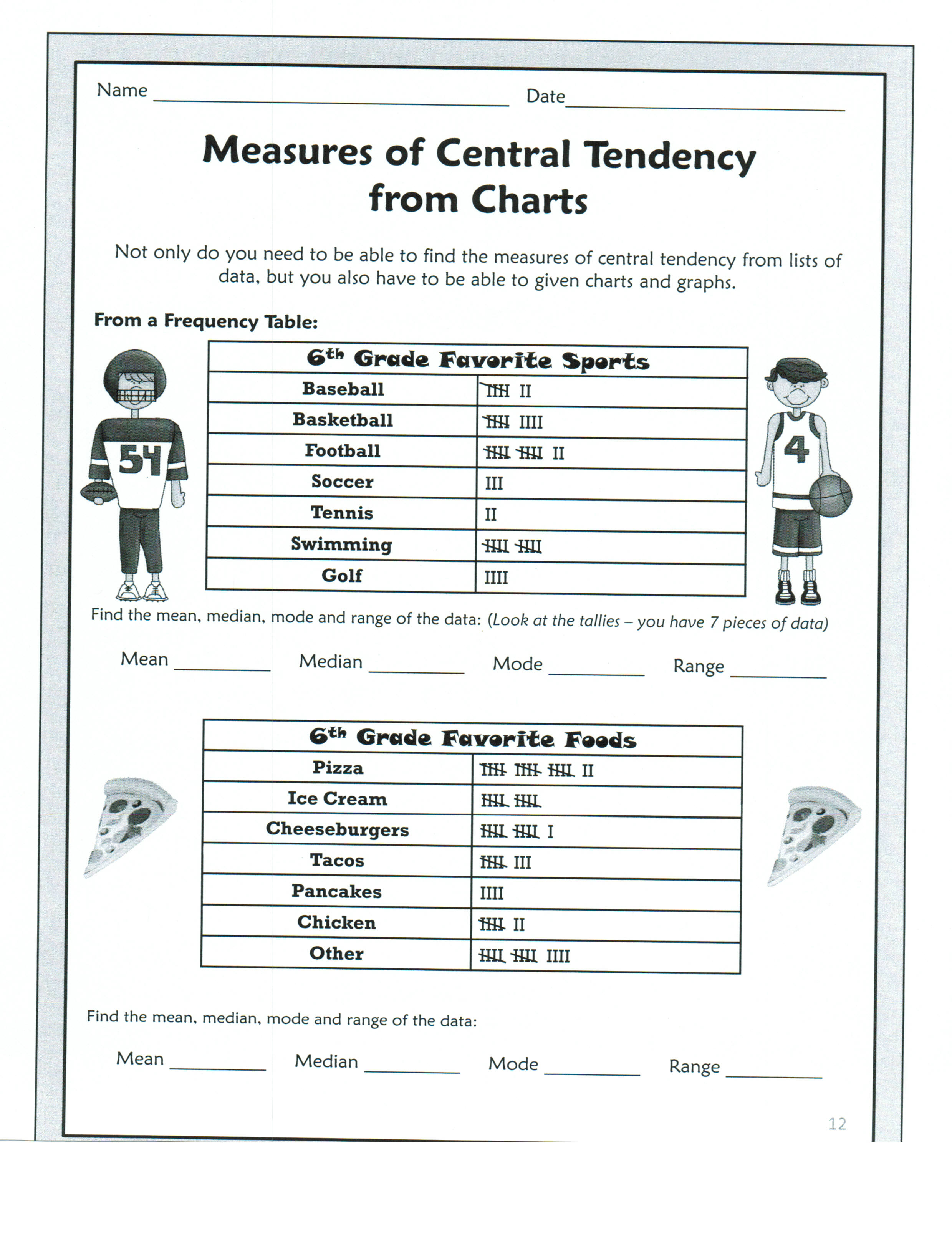
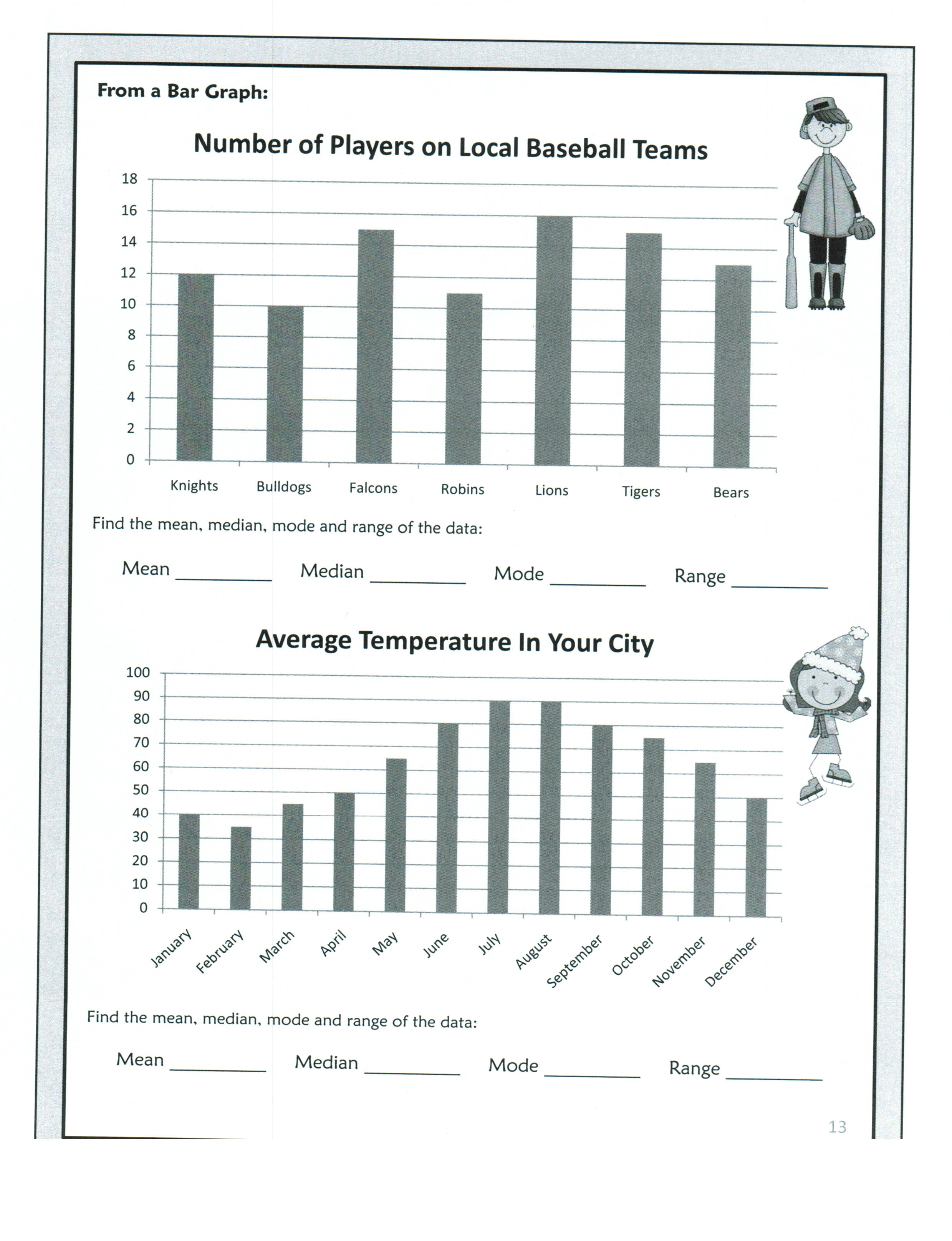
WEDNESDAY - Activating - Check homework with teacher and shoulder partner clearing up any misconceptions. Lesson: Students complete a flip booklet with teacher while learning the definitions of, and how to calculate, the mean, median, mode, and range. Begin on foldable with mean, median, range, and mode problems. Vocabulary: mean mode median range Exit Ticket: Explain the 4 ways to find measures of central tendencies. Homework: Finish what ever is left of the foldable.
THURSDAY - Activating: Check homework with teacher and shoulder partner clearing up any misconceptions. Lesson: Students work through PPT- Interquartile Range as a Measure of Variation – 27 slides. Use handout of steps and work through examples with teacher. Vocabulary: interquartile range Exit TIcket: How does the interquartile range help us analyze data? Homework: IQR problems
FRIDAY - Activating: Check homework with teacher and shoulder partner clearing up any misconceptions. Lesson: . Students work through PPT- Displaying Numerical Data Using Box Plots – 22 slides. Make foldable and put step-by-step instructions in their binder. Vocabulary: box-and-whisker Exit Ticket: How do you find the 5 points to make your box-and-whisker plot?
1 Comment
mackenzie vaneffen
4/2/2015 08:42:11 am
i can not find the videos Leave a Reply. |
Mrs. Beck's Math and Social Studies ClassesCategoriesArchives
April 2015
Categories |
||||||||||||||||||||||||||||||||||||||||
 RSS Feed
